
Mental Health Website Design That Helps Clients Feel Safe

Many therapy seekers start with a web search before they ever send a message or make a call. When working with mental health website design, the real job is not “looking modern,” it is lowering anxiety, building trust fast, and making the next step feel doable. That is also why website design for mental health professionals has its own rules around safety, clarity, privacy, and accessibility.
This guide is for solution-aware practices exploring options, from a simple private practice website to accessible mental health platforms that support content and community. You will see what “good” looks like, which site type fits your situation, and what to audit before you redesign.
What “Good” Looks Like: Criteria for Client-Safe Therapy & Mental Health Website Design
The primary user is almost always the potential client, not your peers, not other clinicians, and not Google. Client-centered design starts by assuming your visitor may be stressed, uncertain, and scanning for signs of safety, confidentiality, and fit.
Success criteria should be simple and measurable, like consult-request clicks, contact form completion rate, and time-to-find key info (fees, insurance, and how to book). You want trust signals that feel human, easy next steps, and low-friction contact options like a contact form, online scheduling, and a phone number that is easy to tap on mobile-friendly design.
A user-friendly design for therapy should also reduce overwhelm. Quality over quantity matters here, so aim for fewer choices, clearer pages, and predictable navigation supported by solid information architecture.
Safety First: Design for the Nervous System
Designing for the nervous system means lowering cognitive load before you ask someone to read or decide. Use clear visual hierarchy, generous white space, readable typography, and gentle motion, or none, so the page feels steady.
Color psychology can help when it is subtle and tested for readability. Some practices use a “warming” color journey down the page, starting with cooler or neutral tones and gradually introducing warmth as users scroll, which can feel more welcoming when it’s tested for readability and contrast.
Clarity Over Cleverness
Plain language beats clever taglines almost every time. Short paragraphs, direct reassurance, and a consistent tone of voice make it easier to understand services, fees, insurance, and telehealth without rereading.
Your first 10 seconds should answer three questions. Who you help, how you help, and what to do next should be visible above the fold with one clear set of calls to action.
Option 1: Simple, Clean Private Practice Website (Best for Most Therapists)
For many clinicians, therapist website design works best as a small, focused site that feels calm and professional. A typical private practice website is 5 to 8 pages, built to support one primary action: schedule a consult, call, or submit a contact form, though the right page count depends on your services, locations, and policies.
This approach fits well when you offer a few specialties and want a clear presence that does not feel salesy. It is also easier to keep accurate, which matters for keeping your web design up to date when fees, availability, or policies change.
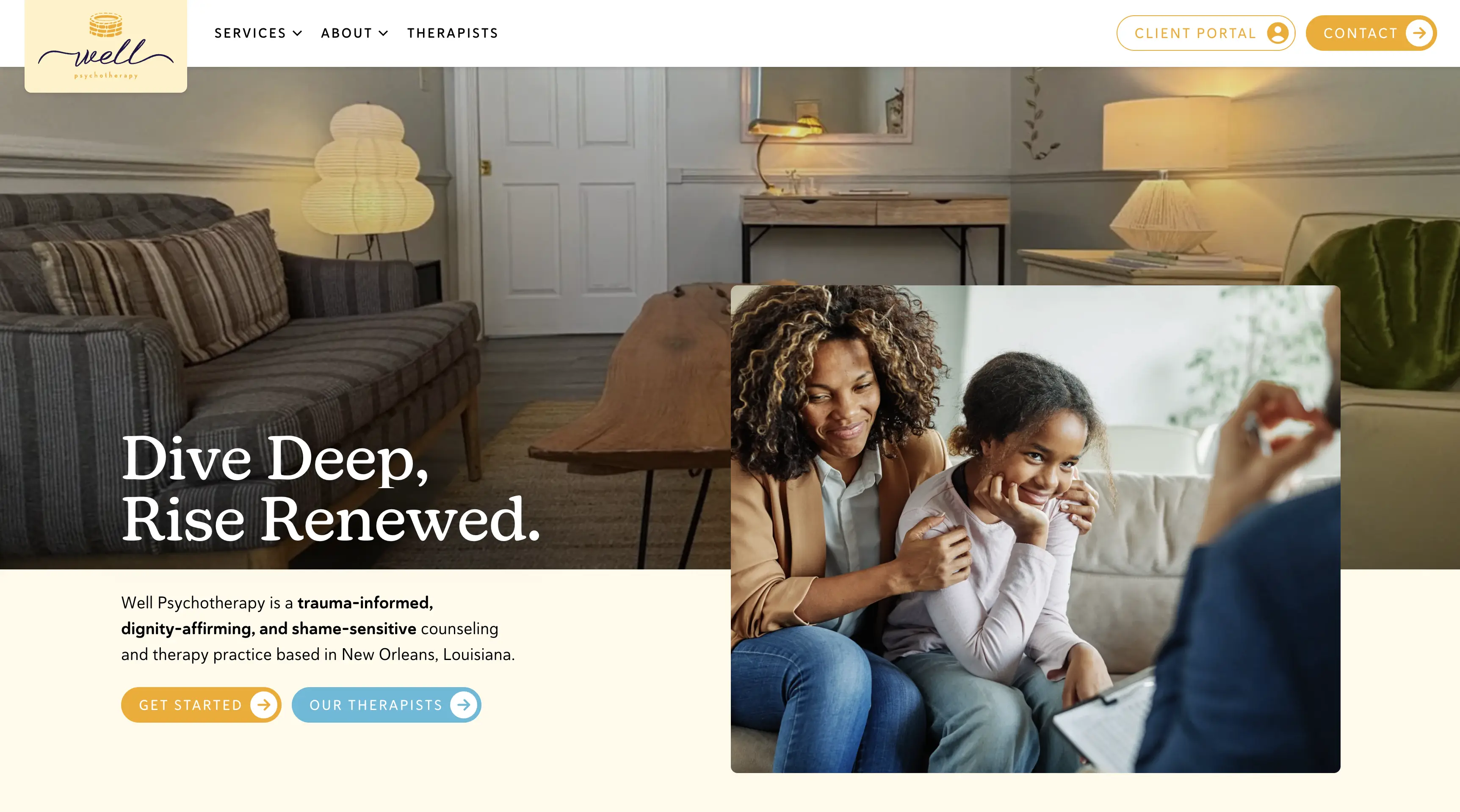
A portfolio-style example to model is Well Psychotherapy. It demonstrates clean design, strong readability, and a supportive flow that helps visitors self-identify, understand next steps, and reach out without friction.
Pros
- Fast to build and easy to maintain
- Clear UX reduces anxiety and decision fatigue for first-time visitors
Cons
- Less room for complex programs, multiple locations, or many service lines
- May need a content plan later to compete in local SEO
Must-Have Pages and Elements
Pages: Home, About, Services, Fees/Insurance, Contact, Privacy policy
Above-the-fold: supportive headline, specialties, and one clear CTA
If you are exploring professional help for build quality and structure, Shepherd Web Design & Digital Marketing shares a straightforward overview of their website design approach. Their positioning around honest guidance and sustainable growth is a strong fit for practices that want clarity without pressure.
Option 2: Clinic or Group Practice Website (Best for Multi-Provider Teams)
A mental health clinic website or group practice website has a different job than a solo site. It must support multiple clinicians, specialties, and pathways while still feeling simple for a stressed visitor.
The biggest win is intake routing. Done well, you can offer “help me choose” flows, filters, and clear service categories without turning the menu into a maze.
This site type is also built for credibility and consistency. Provider bios, a provider directory, and standardized service pages help clients compare options in a way that feels respectful and not transactional.
Pros
- Scales for multiple providers, locations, and service types
- More opportunities to rank: provider pages, specialty pages, location pages
Cons
- Higher content and governance needs to keep pages accurate and up to date
- More UX complexity: navigation and internal search must be thoughtfully planned
Key UX Patterns That Reduce Friction
A directory works best when it uses consistent structure across every clinician. Include credentials, specialties, “best fit” language, and an availability cue that does not overpromise, such as “accepting consults” or “waitlist available.”
Keep the intake form short (often name, contact info, and a brief reason for reaching out) and set expectations. State response time, next steps, and what happens after submission, including boundaries around email or text so confidentiality is protected.
If your practice serves multiple cities, publish location clarity without stuffing pages. A simple “areas we serve” hub can support discovery while keeping the experience calm.
Option 3: Accessible Mental Health Platform or Resource Hub (Best for Content + Community)
A resource hub is the right choice when you publish articles, run groups, offer courses, or support ongoing engagement. It can also work for clinics that want a library of non-triggering education that builds trust before someone reaches out.
Accessibility is not optional in this model. Accessible mental health platforms should be built for diverse needs, stress states, and devices, with responsive design that stays readable on phones, tablets, and desktops.
The tradeoff is operational. You need a content model, publishing standards, and an ongoing maintenance plan so older content stays accurate, inclusive, and aligned with ethics guidelines.
Pros
- Builds authority and trust over time with helpful, non-triggering content
- Supports multiple journeys: learn, self-screen, contact, schedule, join a group
Cons
- More complex IA and higher ongoing content workload
- Greater risk of clutter if governance and accessibility checks are inconsistent
Accessibility and Content Safety Must-Haves
WCAG 2.1 AA–aligned contrast, readable typography, keyboard navigation, and descriptive link text are common accessibility best practices. If you are thinking about ADA compliance, start by improving usability and accessibility, and document what you change as you iterate.
Add content warnings where appropriate and keep crisis resources visible without being alarming. Many practices include the 988 Suicide & Crisis Lifeline (or a local equivalent) in the footer, on the contact page, and anywhere heavy topics are discussed.
Avoid autoplay media. Autoplay video, sound, or aggressive animation can spike stress, especially for trauma-informed design where empathy in design means giving the visitor control.
Quick Comparison Table: Which Approach Fits Your Practice?
Use this table to choose based on complexity, maintenance, SEO potential, and client comfort. As a default, a simple private practice website is the safest starting point unless you clearly need multi-provider routing or a content program.
Timeline and budget ranges vary by scope and approvals. A simple site may take a few weeks, while a group practice website or platform often takes longer due to content, provider coordination, and accessibility checks.
If organic search is a major growth channel, plan for ongoing work. Shepherd’s SEO services are positioned around sustainable, long-term results, which fits well when you want steady lead flow without chasing trends.
How to Choose (and What to Audit Before You Redesign)
Start with website goals that are specific. Define who you help, what you want the visitor to do, and what “safe” feels like for your brand, including tone of voice, imagery guidelines, and the level of detail you share about process.
Next, run a high-level key features audit. Check mobile-friendly design, page speed, accessibility, clarity, and trust signals like credentials, specialties, and transparent policies around fees, insurance, and telehealth.
Plan to keep it current. Quarterly reviews are usually enough to confirm fees, availability, intake steps, and privacy language, plus refresh provider bios and services as your practice evolves.
Messaging and Visuals That Build Trust
Use warm, grounded language and avoid big claims. Explain what sessions are like, what to expect in the first appointment, and how confidentiality works in real-world terms.
Use color intentionally and test it. A gradual warmth as users scroll can work well, but only if readability stays strong and contrast meets WCAG targets.
Choose inclusive imagery and non-stigmatizing language. Avoid visuals that stereotype mental health, and favor photos or illustrations that reflect diverse ages, cultures, bodies, and family structures.
Ethics, Privacy, and Risk Considerations
Be careful with testimonials and reviews. Depending on licensing board rules and ethics guidelines, testimonials may create pressure, imply outcomes, or raise confidentiality concerns, so get informed guidance before publishing them.
Treat forms as a security boundary. Use SSL, enforce HTTPS, and choose secure forms for contact and intake, with clear privacy policy language about data security, retention, and who can access submissions.
HIPAA considerations often show up around tooling, especially whether vendors will sign a BAA when forms or scheduling collect PHI. If your contact form, intake form, online scheduling, or messaging collects health information, confirm how that data is stored and transmitted, and set clear boundaries around email and text communication.
If you already have a site and want a structured way to request changes, Shepherd offers a simple website update intake. For practices focused on local discovery, it can also help to review location-specific strategy, such as little rock SEO, without overcomplicating your navigation.
Frequently Asked Questions
Include clear services and specialties, what to expect, fees and insurance info, and a simple way to contact you. Add a privacy policy and write everything in calm, plain language that supports readability.
Use gentle visuals, predictable navigation, short reassuring copy, and clear next steps. Avoid clutter, autoplay media, and too many choices on one screen.
A website is not automatically “HIPAA compliant” as a blanket label. Any forms, scheduling, or messaging that collects health information should be secured and handled appropriately, with clear confidentiality boundaries.
Soft, low-contrast palettes often feel calmer, but they still must support readability. Test contrast to meet WCAG guidelines, and choose colors that align with your brand so the site feels consistent and trustworthy.
Improve contrast, font size, keyboard navigation, heading structure, alt text, and link clarity. Run WCAG checkers and, when possible, test with real users on mobile and desktop.
So What?
A good mental health website does not try to impress someone into booking. It reduces friction, communicates care through inclusive design, and makes the next step feel safe, whether that is a call, an intake form, or scheduling a first session. If you build around clarity and simplicity first, you can grow content and SEO over time without sacrificing the client experience.
Get a new site for your therapy clinic! Reach out today!
